
The Project
Overview
The plan selection guide is an interactive widget designed to help users find the internet speed they need based on their household internet usage.
I led the team responsible for designing it.
Myself: Team Lead, Design, Research
Gary Sedillo: Design
Vanessa Corona: Research
Paul Esparza: Business Analytics

Design Process
We followed a rather rigorous design process in which we continually gathered insights from our users and iteratively adjusted our design to fit their needs.
Initial Research
Need-Finding User Interviews
To better understand how people determine the internet speed their household needs, particularly people in our target demographic, we interviewed individuals in rural areas using Microsoft Teams. We reviewed the interview recordings and distilled our findings into an actionable list.


Web Analytics
I created a Data Studio report built on Google Analytics data to understand how people were using the original solution. Several findings from this report were used to inform our strategic direction and future design decisions.

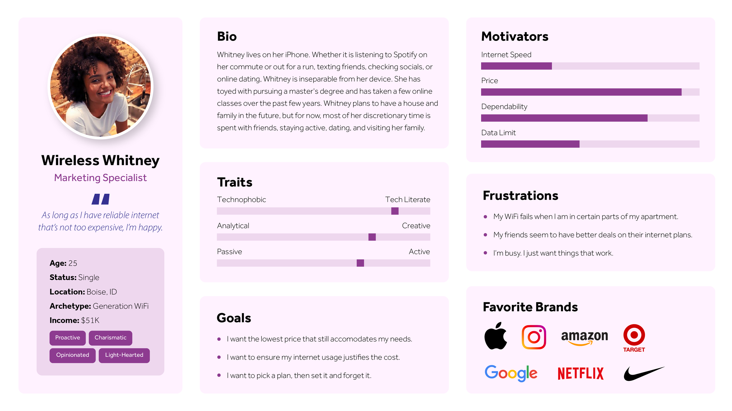
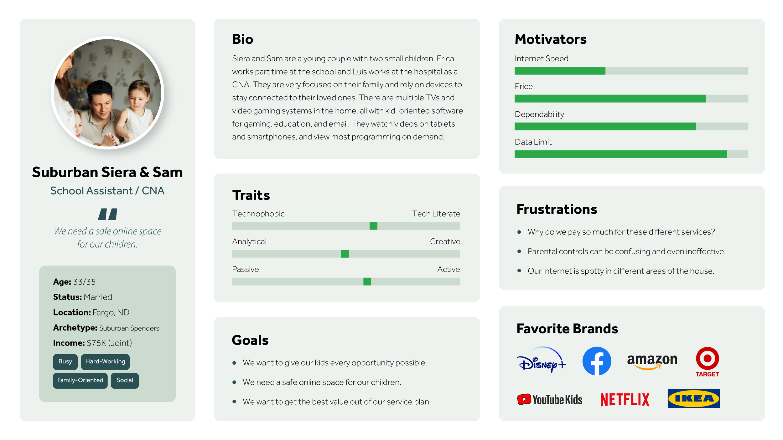
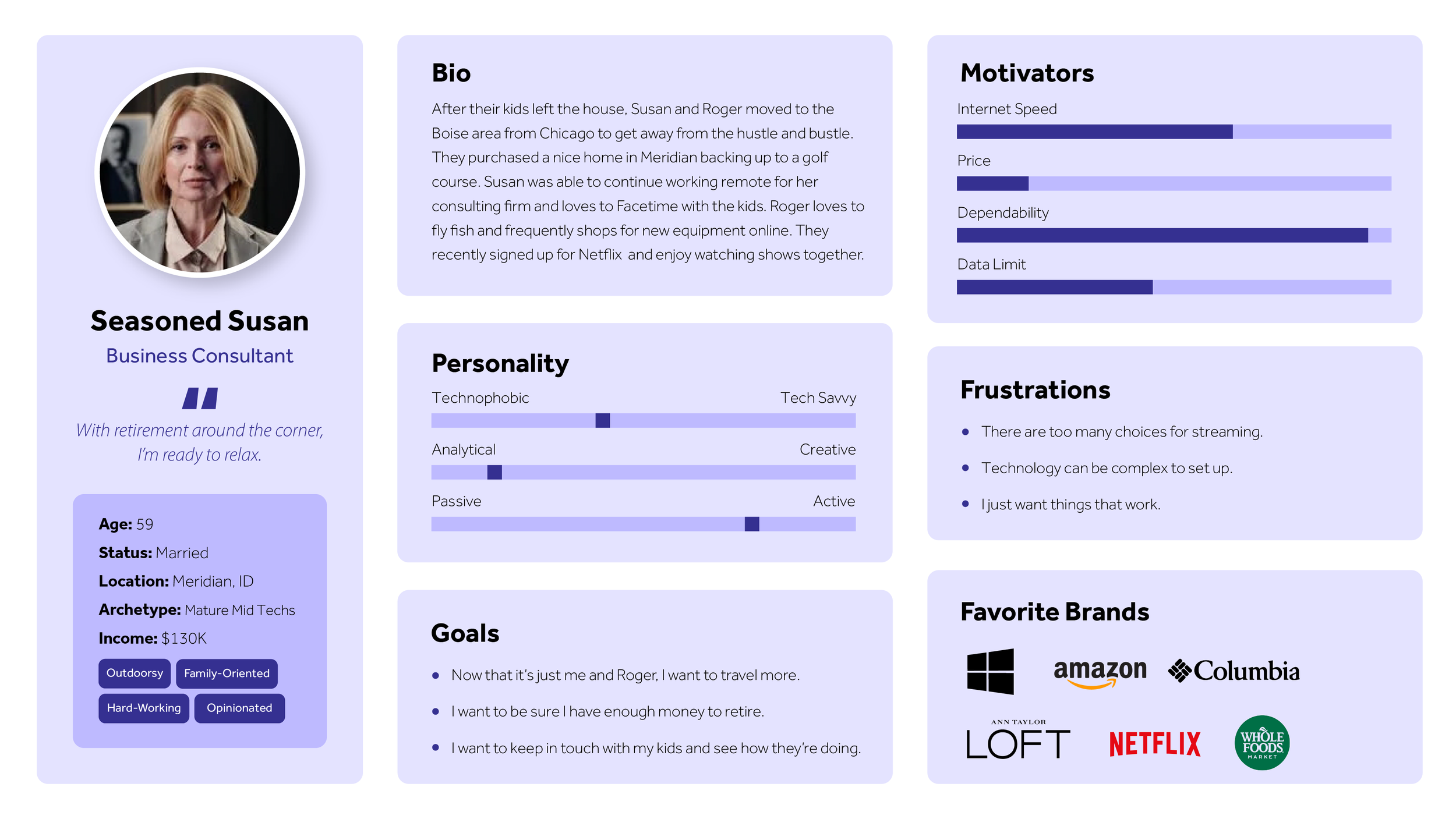
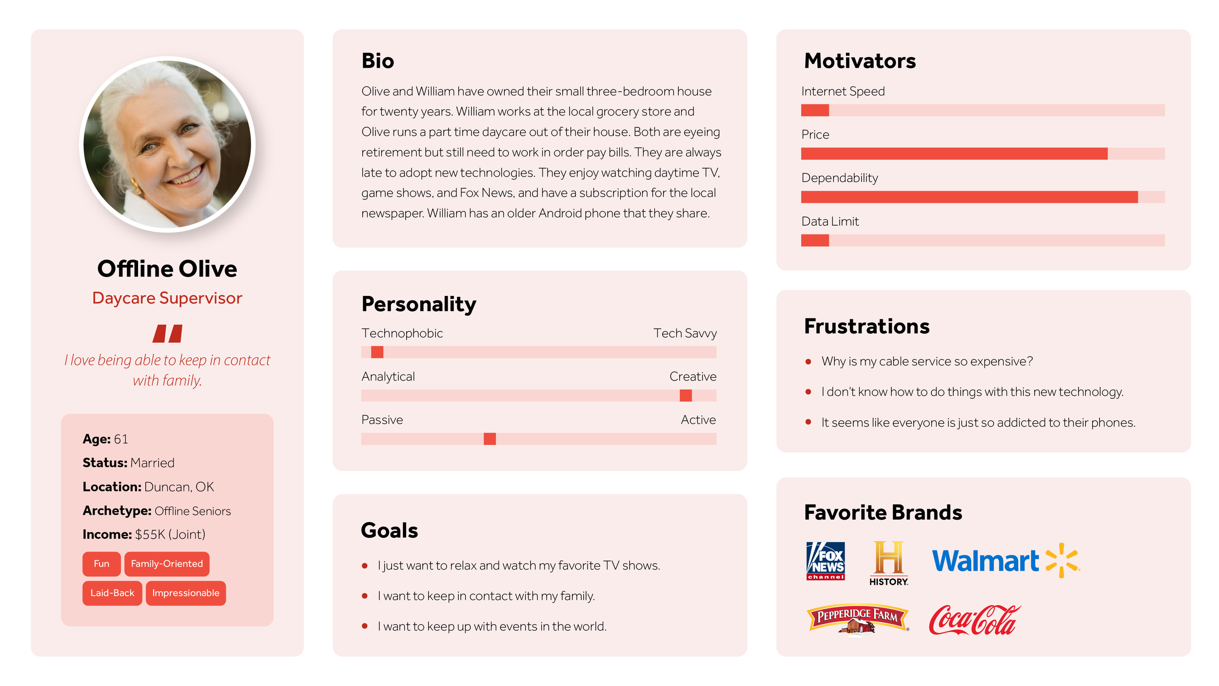
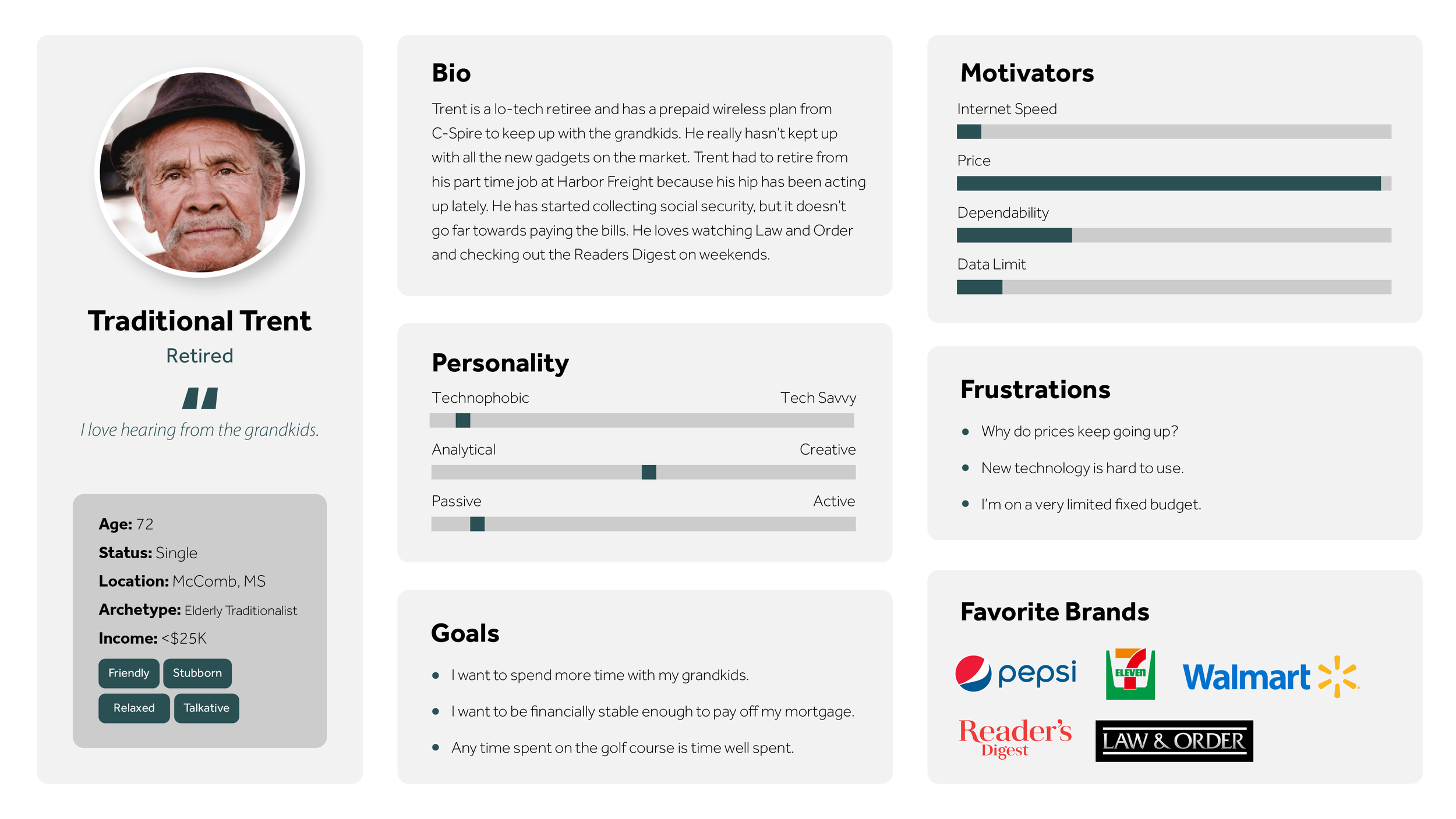
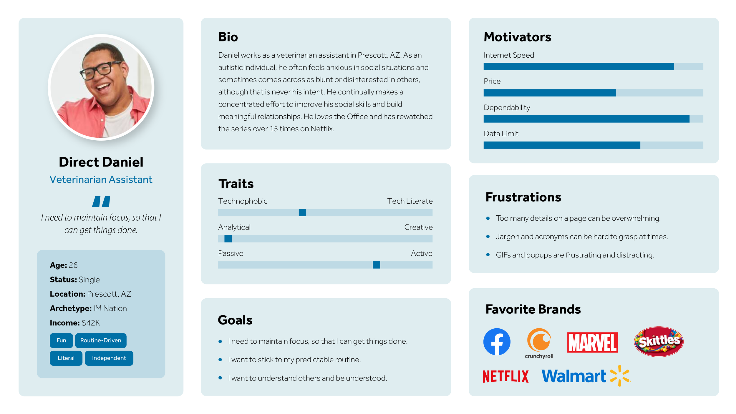
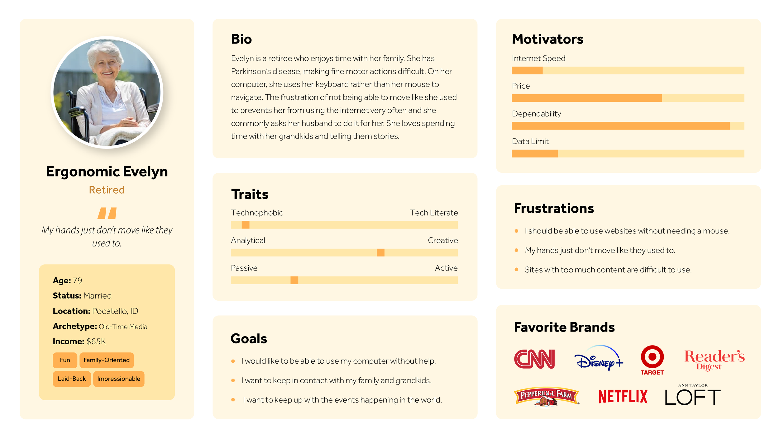
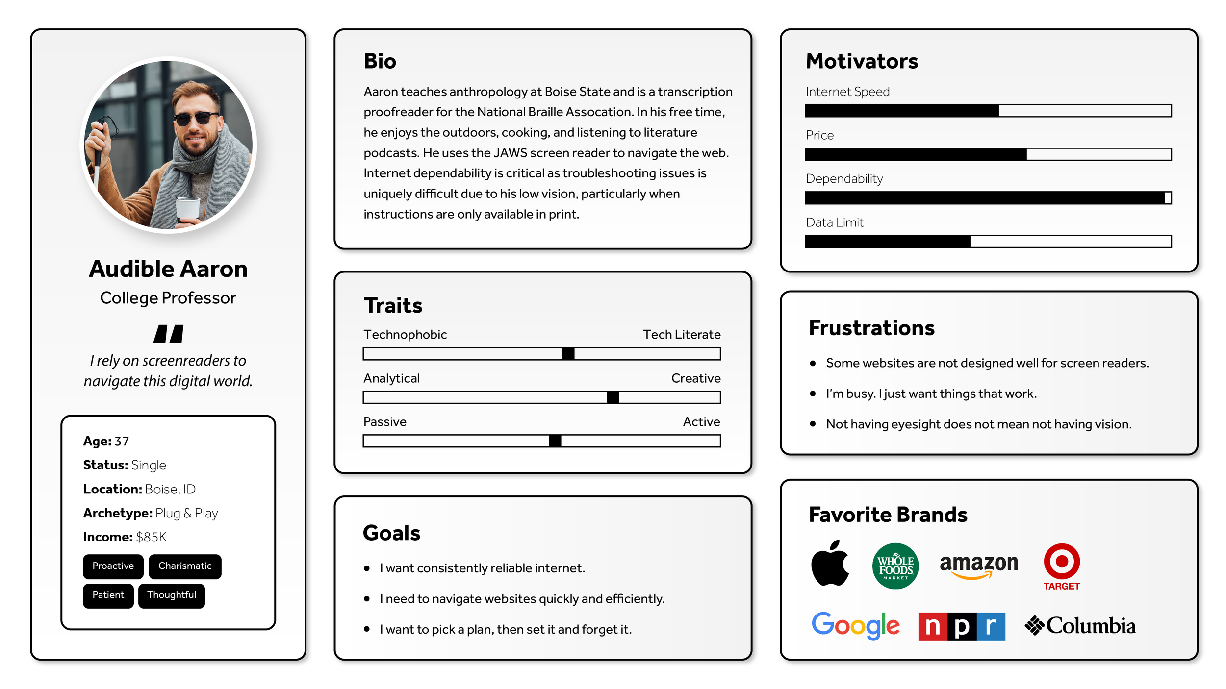
User Personas
Previous to this project, I performed extensive research to understand Sparklight’s users. This research culminated in several personas. These personas were yet another data point used to inform the design of the plan selection guide.
Methodologies included user interviews, on-page surveys, email surveys, call center interviews, web data analysis, and cross-referencing syndicated reports.

Wireframe
Initial Design
Based on our research findings, we brainstormed a desktop solution first. The mobile version soon followed. Both were reviewed with the team and adjustments were made based on the group’s recommendations.

Interactive Low-Fidelity Prototype
Once the wireframe was reviewed by the team and approved to move forward, an interactive prototype was developed in preparation for usability testing. We kept the design bare bones so we could focus solely on functionality before getting feedback on visual details.


Usability Testing - Round 1
We conducted usability tests and recorded them in Microsoft Teams. The key findings were noted and prioritized based on their degree of impact and ease of implementation. Overall, users liked the tool and were inclined to trust the recommendations.
Found Issues and Suggested Fixes
-
Impact: High
Difficulty: EasySuggested Solution: Move the gauge to the top.
-
Impact: High
Difficulty: DifficultSuggested Solution:
Users expected to see a “work from home” option but didn’t find it. We need to generate a list of device types that align with tasks users perform rather than just devices we look at on our end. -
Impact: High
Difficulty: Easy
Suggested Solution:
Adjust wording to better match user expectations (e.g. “quick view” and “detailed view”). -
Impact: Medium
Difficulty: EasySuggested Solution:
Add a “reset” button. -
Impact: Medium
Difficulty: MediumSuggested Solution:
Collapse the item selection once the user has chosen an answer and automatically open the next question. -
Impact: Medium
Difficulty: DifficultSuggested Solution:
Carry over the recommended internet plan when the user switches modes while auto-populating questions to best represent the answers the user provided in the previous mode. If user returns to a mode they’ve already answered, restore the answers they originally had. Alternatively, we could combine modes so there is only one method for answering these questions. -
Impact: High
Difficulty: HighSuggested Solution:
Only provide the functionality offered by the advanced view.

High-Fidelity Prototype 1
Design
Using the wireframe and recommendations from the usability testing, we designed a high-fidelity mockup. The mockup included a desktop and mobile version.

Interactive High-Fidelity Prototype
After a few design reviews and iterations with the team, we added interactivity to the design in preparation for usability testing. This time, we wanted to see how usability translated to our desktop design.
Usability Testing - Round 2
We conducted usability tests with this high-fidelity prototype. Again, we noted our usability test findings and generated a list of design adjustments for the next iteration.
Found Issues and Suggested Fixes
-
Impact: Medium
Difficulty: EasySuggested Solution:
Add a “buy now” button directly under the suggested internet plan. Include the widget in close proximity to internet plan cards. -
Impact: Medium
Difficulty: EasySuggested Solution:
Include internet upload speed under the suggested plan. -
Impact: High
Difficulty: ModerateSuggested Solution:
Workshop other ways to ask these questions in a simpler and consistent way. -
Impact: High
Difficulty: EasySuggested Solution:
Provide clearer instructions to participants in the usability test instructions without biasing users with too much information. Include a few extra artboards to accommodate multiple answer selectons. -
Impact: High
Difficulty: DifficultSuggested Solution:
Rework the questions and available answers to allow users to pick more accurate representations of their internet usage. For example, rather than providing answers of a range of devices (1 to 3) provide a ticker or increment widget to let them pick precise numbers. -
Impact: High
Difficulty: DifficultSuggested Solution:
Better align the questions and available answers to fit user needs/expectations. Ask the questions from their viewpoint.
Calculator Functionality
Logic Development
While the design was in progress, we brainstormed ideas for the calculator’s backend functionality. Two different approaches were developed in Excel to test the logic.
Option 1 calculated the speed recommendation by using the originally planned questions.

Option 2 asked only one question to then be answered in six different categories.
MTurk Experiment - Cognitive Load of Calculator Usage
While reviewing the different calculator options with the team, we decided that user feedback was necessary to determine which calculator was easier to use. We used Amazon Mechanical Turk (MTurk) to quickly recruit approximately 180 users across the United States to interact with the calculators and answer questions about their experience.
Participants were organized into two groups and given surveys through google forms. They received a simple survey that used Paas’ (1992) scale for measuring mental effort. This scale has withstood the test of time in the academic world of cognitive science.


Experiment Analysis
I used proven techniques I developed in my PhD to clean out inattentive responses and crunch the numbers. Option 2 proved to be the better solution.
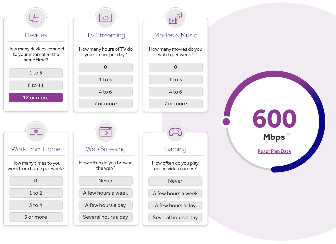
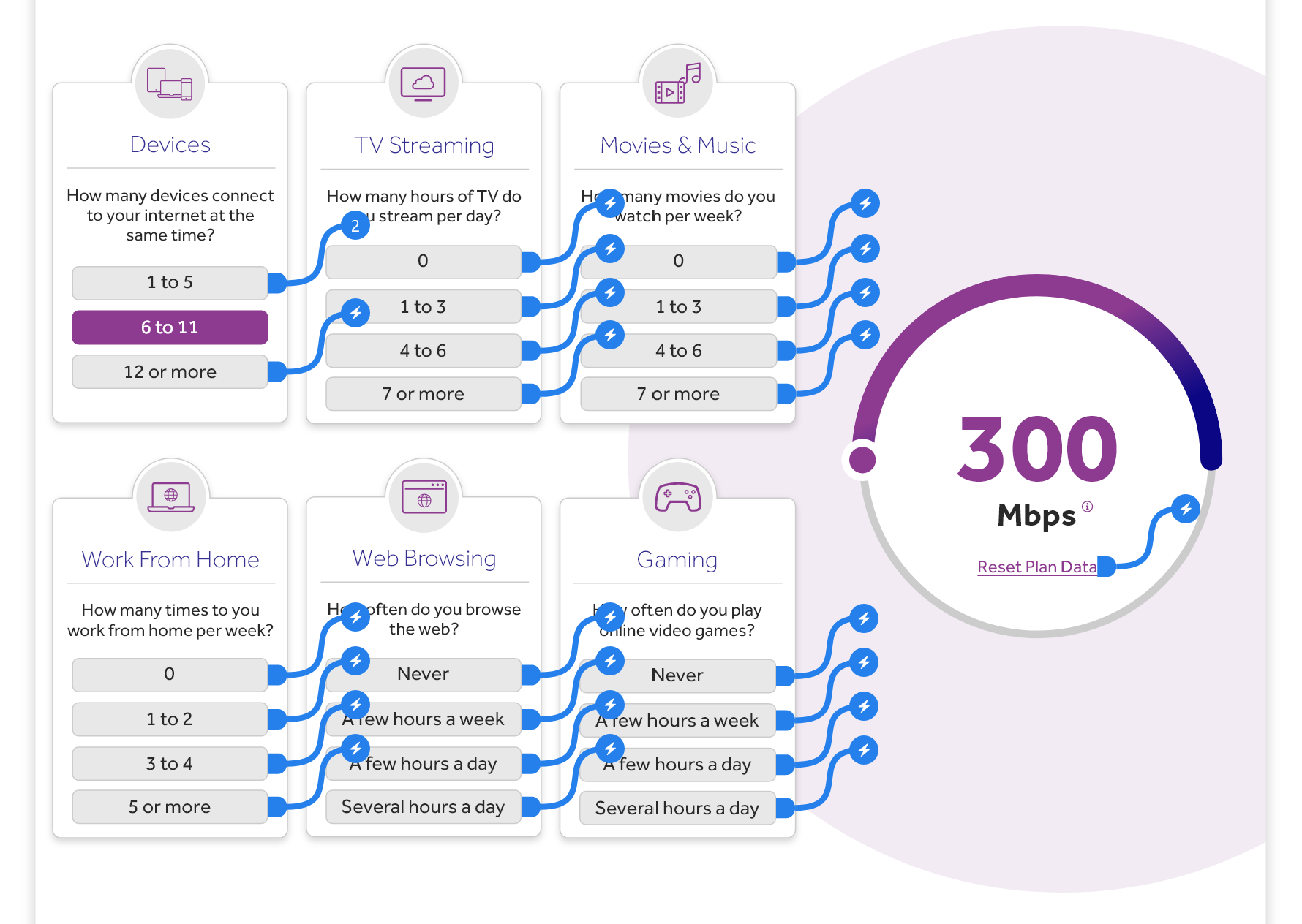
Final Design
Design
We adjusted the design to reflect the more desirable “single question” solution and made adjustments based on our findings in the second round of usability testing. The final design is a simple, trustworthy, and meaningful solution to help users determine which internet speed their household needs.
Stakeholder Integration

Presentation & Reports
With the design finalized, I created a presentation with links to relevant reports for use with cross-functional communications.
While we had greatest authority over the design of our website, we needed consistent communication and buy-in from various teams with their own goals for the website.
Direct Leadership & C-Suite
The most critical stakeholders for this project included my director, the VP above her, and ultimately the C-Suite. My director was included in the iterative design reviews and was a continual checkpoint through the process. As we came closer to completion, we presented to her boss. After presenting to him, he insisted we present to the CEO, COO, and several other leaders in their quarterly meeting.
The design received high praise and prompted deeper discussions about leveraging UX research processes more broadly throughout the company.


Internal Teams & Stakeholders
We also worked closely with several teams throughout the design process to ensure our design not only met usability standards, but was also aligned with strategies across teams. These teams included Product Marketing, Branding, Digital Advertising, and Customer Experience.